Robot vacuum cleaning zones
Dyson - 2018
Dyson was working on an improved version of its debut robot vacuum cleaner called the 360 Heurist™ robot vacuum cleaner promising more power modes, low light cleaning and customisation of the robot's behaviour in each room.
My role
I worked in a team of 3 designers, many software and hardware engineers as well as key stakeholders dedicated to this secret project. Each designer focused on different parts of the project experience. The robot specifications changed constantly making this really challenging to plan for. I focused on enabling users to create cleaning zones as well as give them control over those zone behaviours. My contributions to the team and the product involved
Brainstorming with other designers
Storyboarding use case scenarios
Gathering technical requirements
Wireframing user-flows
Prototyping low & high fidelity prototypes
Presenting to stakeholders and engineers
Planning and conducting usability trials
Collaborating with engineers on implementation
Co-planning sprints with product managers
High fidelity interface design
The design objective
Help people understand their robot generated map
Enable people to divide their map into zones to better manage power usage
Allow users to label their newly created rooms to easily identify them
Integrate power zoning into the existing robot controls
Help people understand their robot generated map
Enable people to divide their map into zones to better manage power usage
Allow users to label their newly created rooms to easily identify them
Integrate power zoning into the existing robot controls
Getting users familiar with their map
Once the robot has completed a mapping mission, it generates a map of the areas it has mapped out. From some initial research carried out by other teams, it was actually quite difficult for someone to recognise the ground plan of their own home. When given a picture of the floor plan of our testing home to participants, they rotated the map a few times to orient themselves with varying success depending on the person's ability to formulate their bearings to the map.
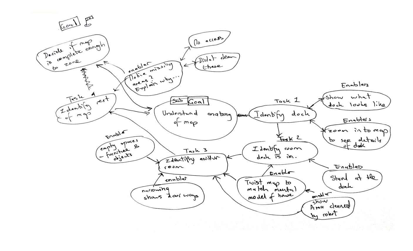
Not only was this tricky but people found it difficult to decipher the shapes inside the map too. Objects like furniture and items left on the floor can distort the map, making it unrecognisable. There might be areas missing that the robot might not have completely mapped out because of closed doors. What we did find out was that when showing a participant the robot charging dock on the map, it was far easier for them to orientate themselves to the map.
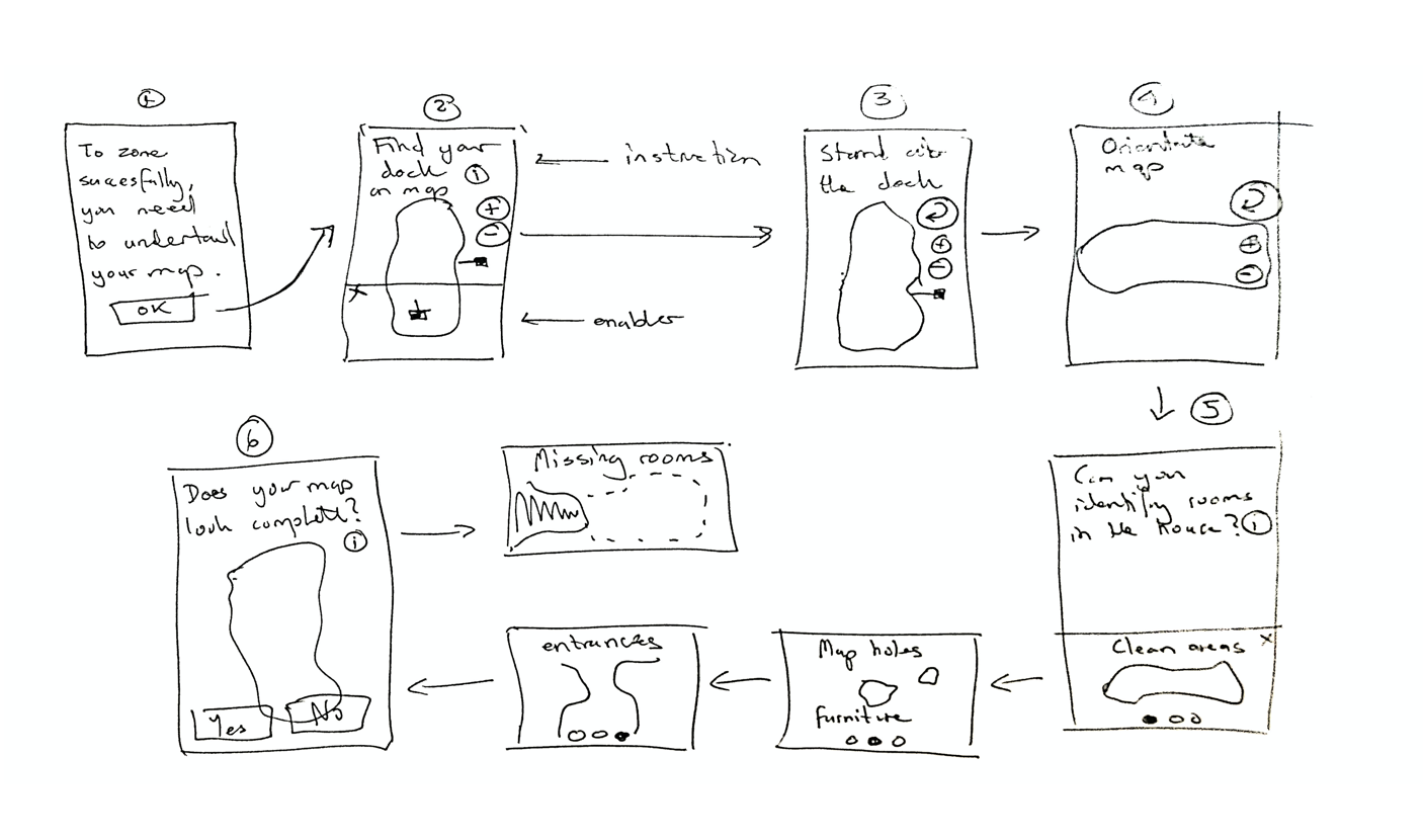
Armed with this knowledge, I devised a map onboarding flow that takes the user through a succession of steps with the goal of giving users enough confidence and knowledge to decide if their map was complete enough to continue zoning it.
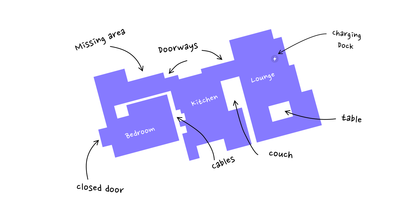
To illustrate this, I had the idea to have an animation of a birds-eye view of a room and overlay the robot map to illustrate how the physical layout is translated into what the map will end up looking like. I used the already established visual design language. These are the final images rendered by the imaging team.
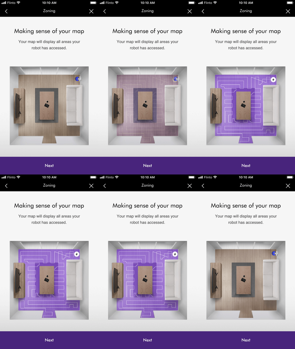
To show where the robot starts from and where it cleans
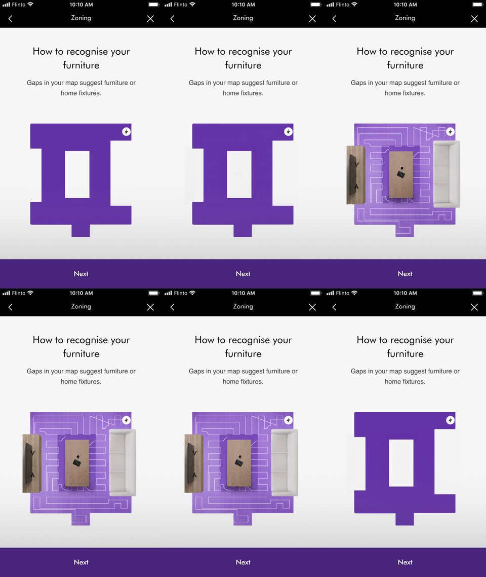
To illustrate what the whte spaces represent ie - furniture or fixtures
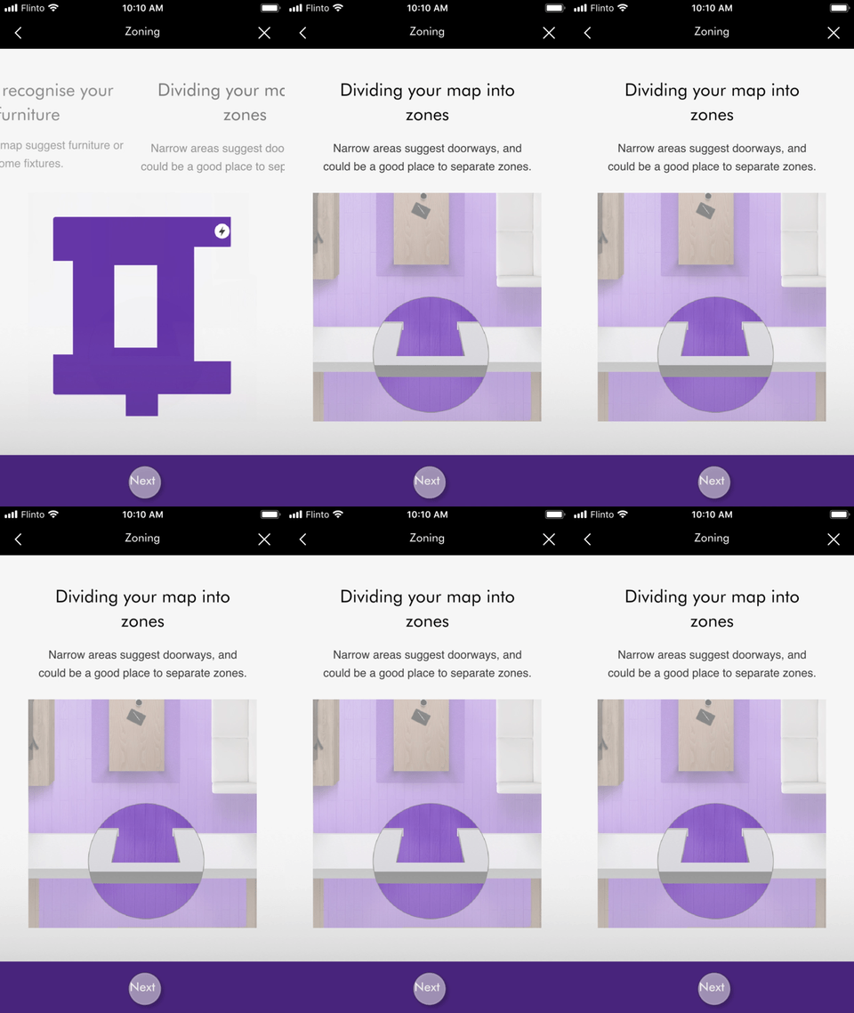
To show the narrowings indicate a new room.
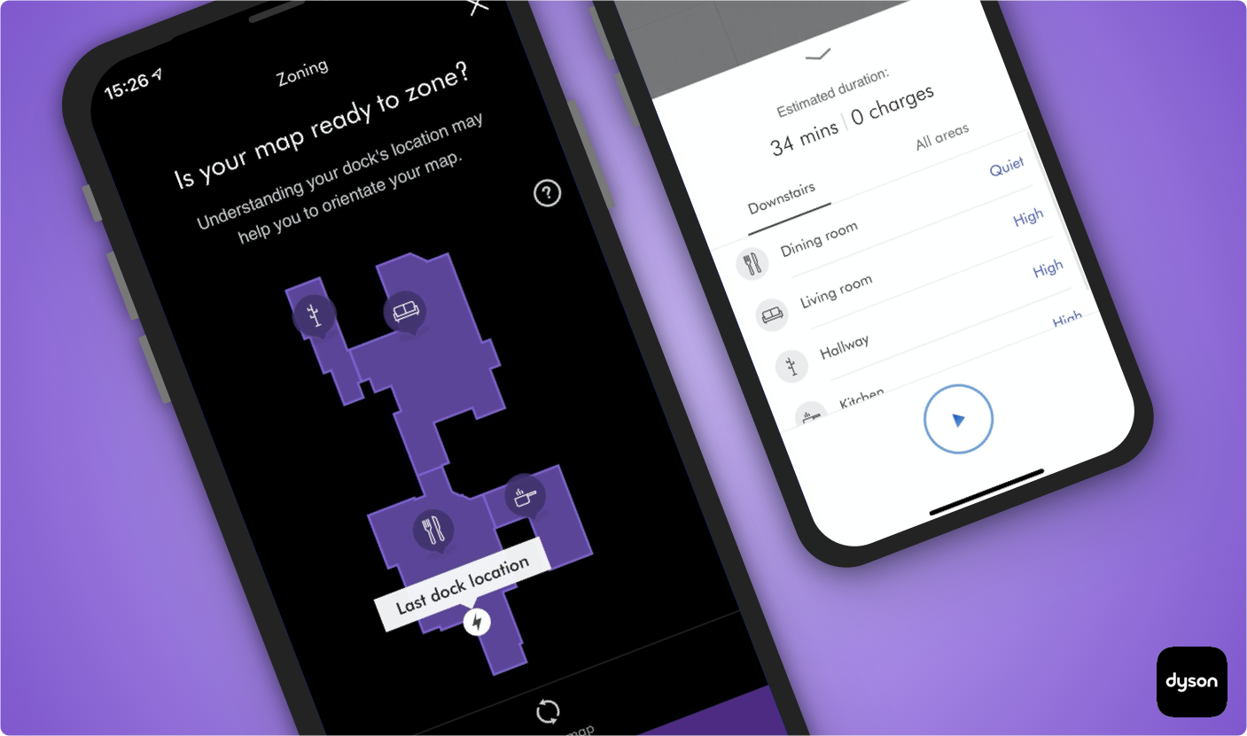
Once this is explained during onboarding, the user can then rotate the map to suit their mental image. At this stage, the user is then asked if they are ready to zone their map. This screen also helps the user orientate themselves by identifying the charging dock location.
To further aid the user in deciphering their map, I placed a question mark next to the map as a source of help if they thought something was missing. I used some ideas from the robot manual as well as some other possible reasons.
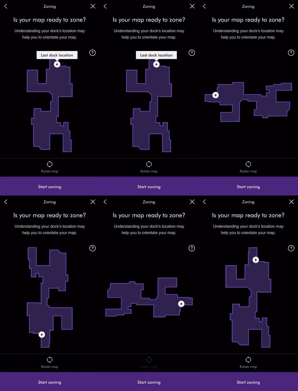

At this stage I used I Flinto for mac and sketch to prototype these animations and interactions. It provided a good combination of gestures and transitions.
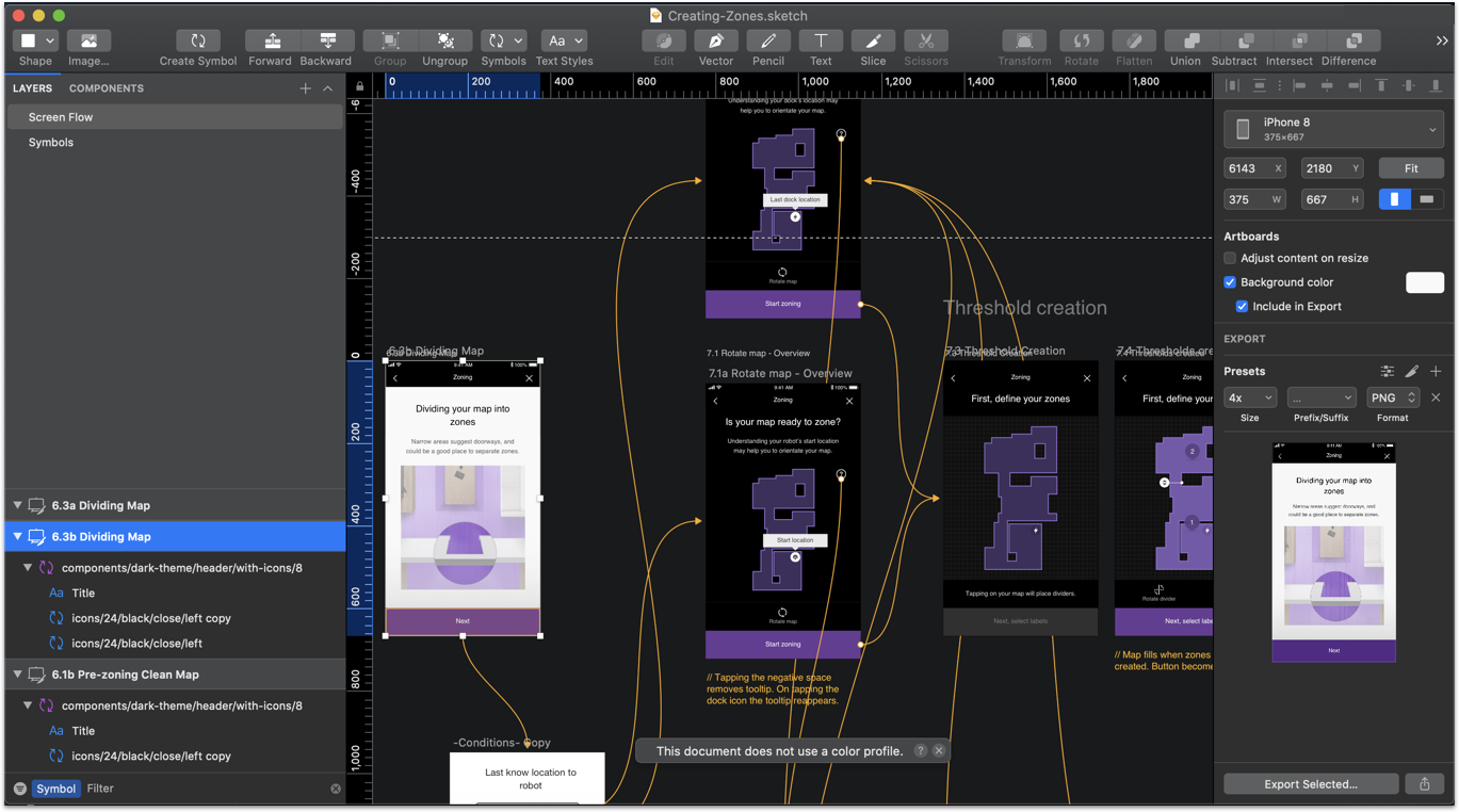
Dividing the map into zones
Once the map has been orientated and the user is ready to zone the map, they must now place dividers onto the map to dissect it. I conducted some competitor analysis with some colleagues. The bar was low. We could way better.
I figured out that the simplest interaction a user could make would be simply to tap and the divider would appear. The question is how would it dissect the area? Horizontally or vertically? How would the user rotate the divider if it didn't divide the area correctly?
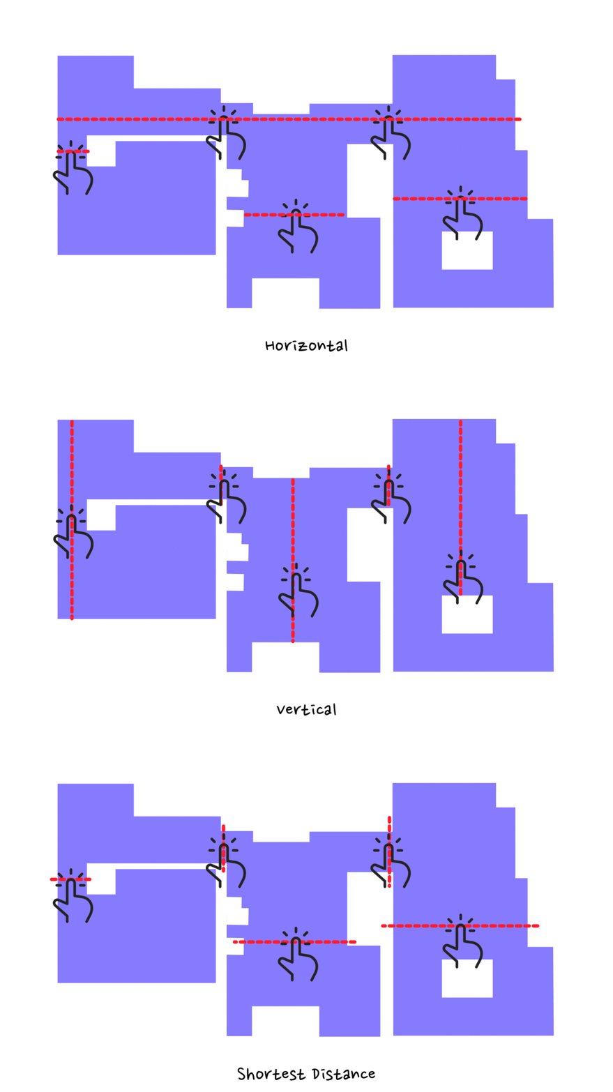
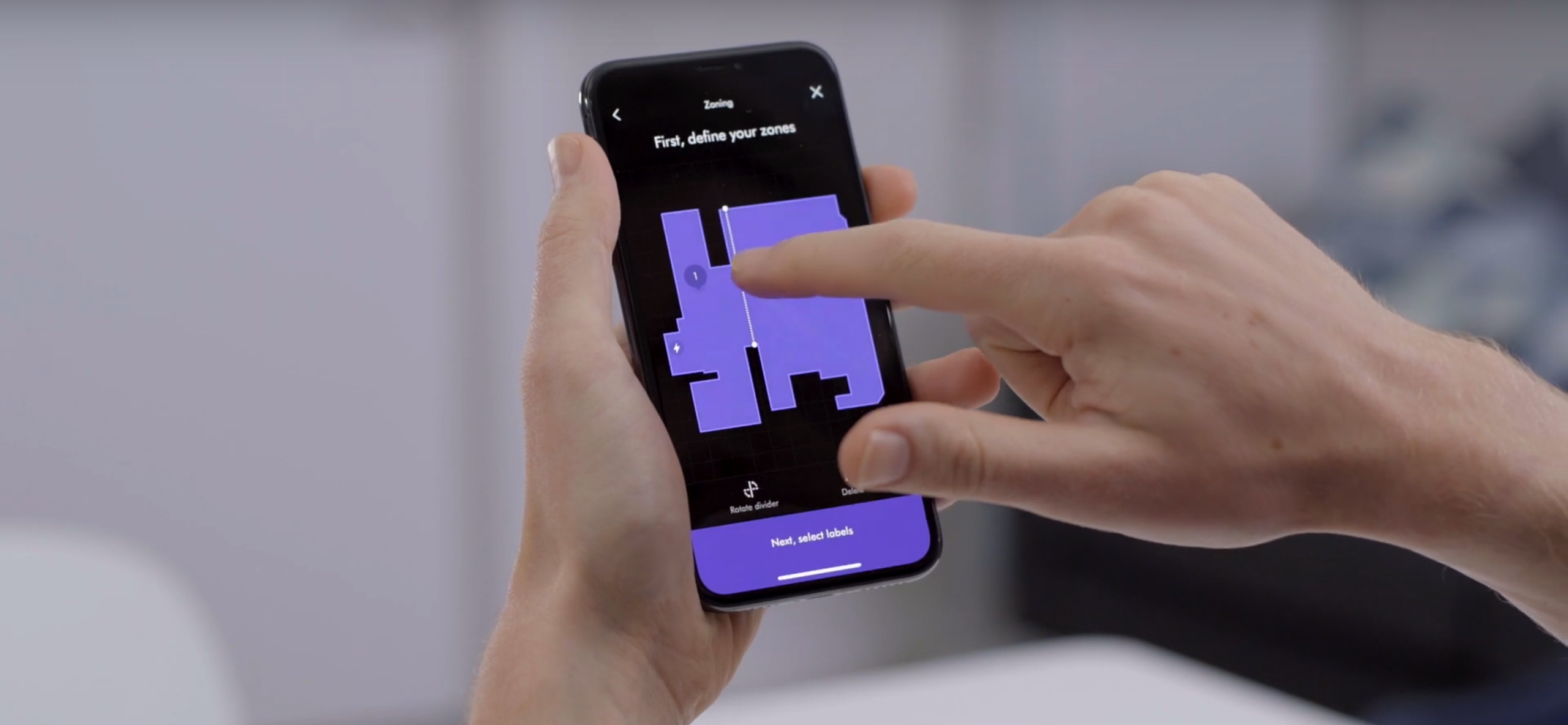
I noticed from the initial research that dividing areas by the shortest distance were the most common pattern used by participants. It's naturally how we divide rooms. Using this knowledge, I prototyped this interaction technique and gained buy-in from the team and engineers into using this method. I inserted numbers into the map in the order the user divided it up in. It always had to start counting from where the charging dock was. This made it easier when labelling.

Placing dividers using shortest distance
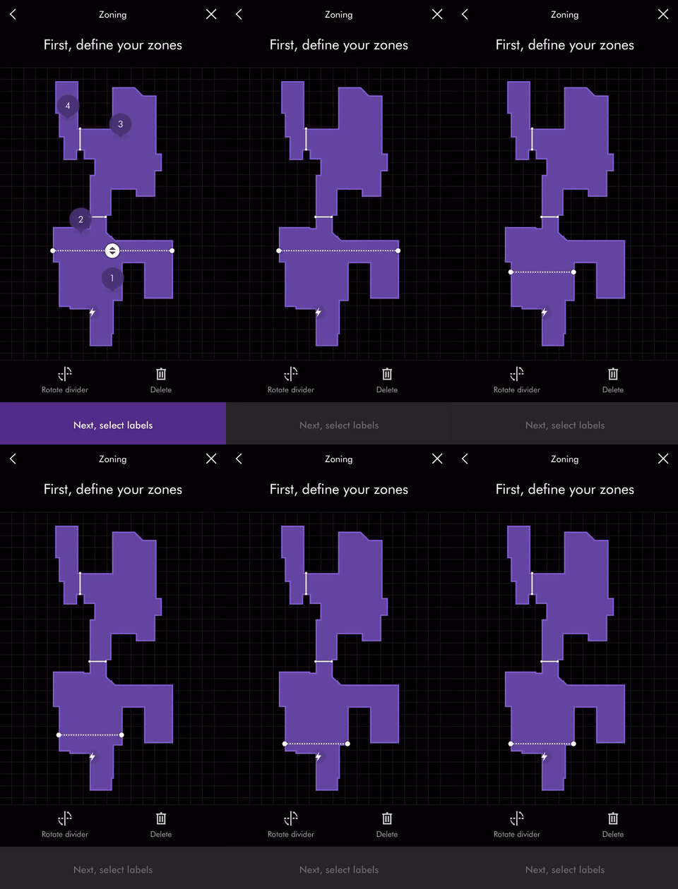
Moving the divider

Rotating the divider and removing it
Naming the zones
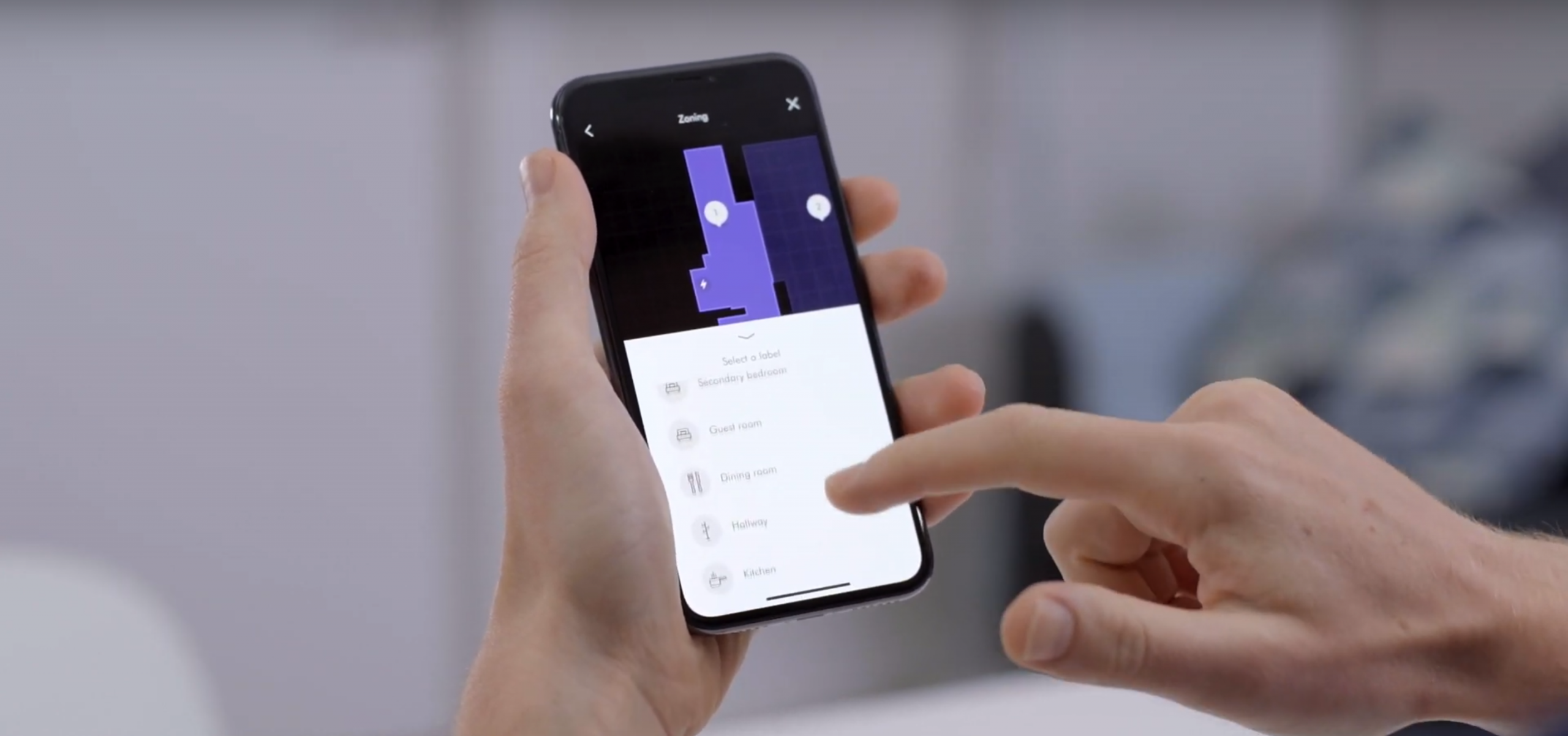
I tested two different interaction patterns with participants: The first one was user-led where the user could tap on any zone to label it. The 2nd that I tested was more of a wizard-like pattern where users would be led sequentially through each zone. The results from these were mixed. I then created a third prototype that combined the best parts of the two ideas which ensured smoother interactions but with the freedom to tap on any zone simultaneously.

Creating the labels

Editing the labels
I wrote a test script and conducted testing in our mock home lab where participants were asked to divide and label the zones. It was a success and participants found it really intuitive to use. I worked with one of the graphic designers to produce a set of commonly used room labels and icons.
Greater power, greater control
Now that the user has a zoned map, users can change power modes for each zone. This makes cleaning more efficient by reducing unnecessary power used in low traffic areas. I designed the power tray to allow users the choice to clean everywhere with the same power mode or clean using their customisation.
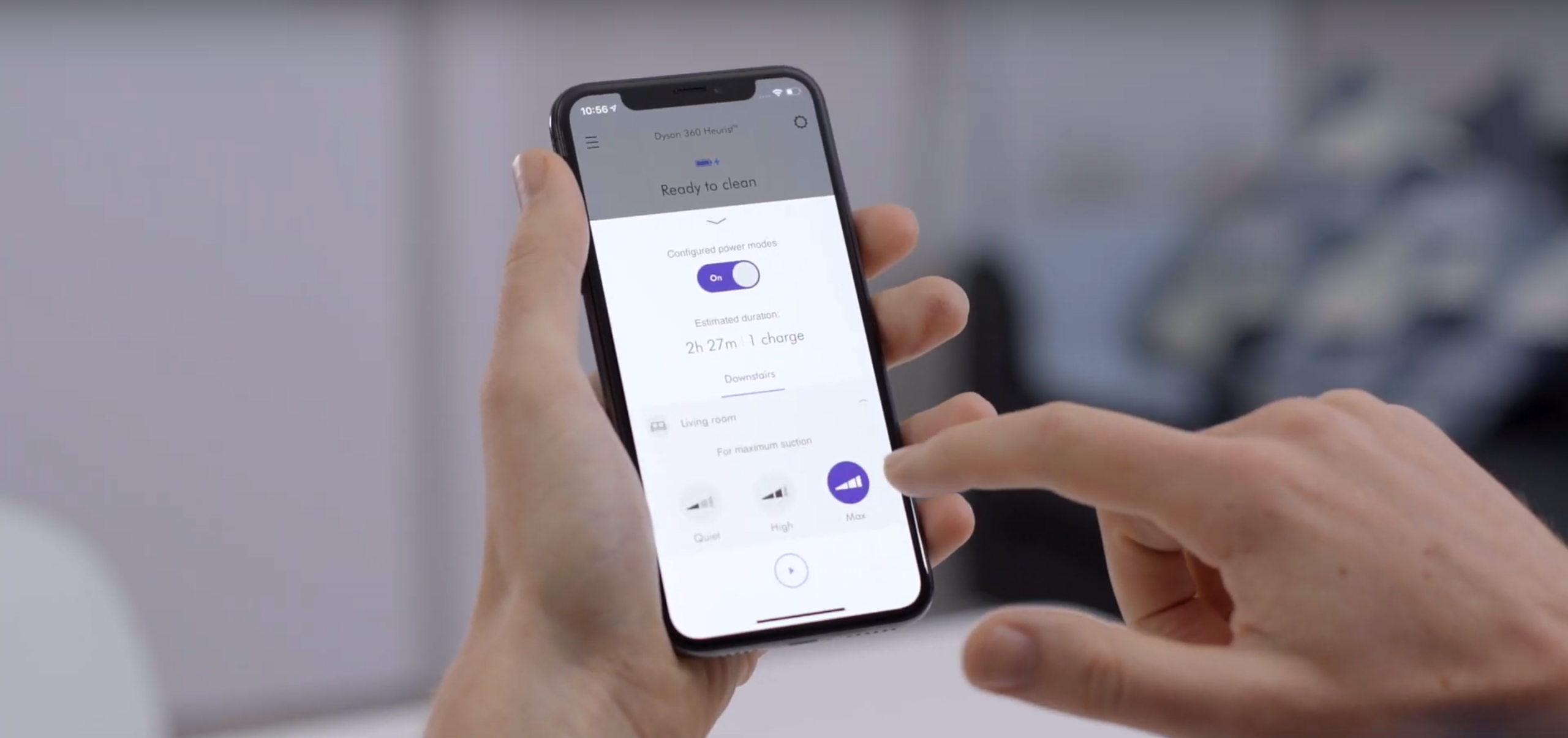
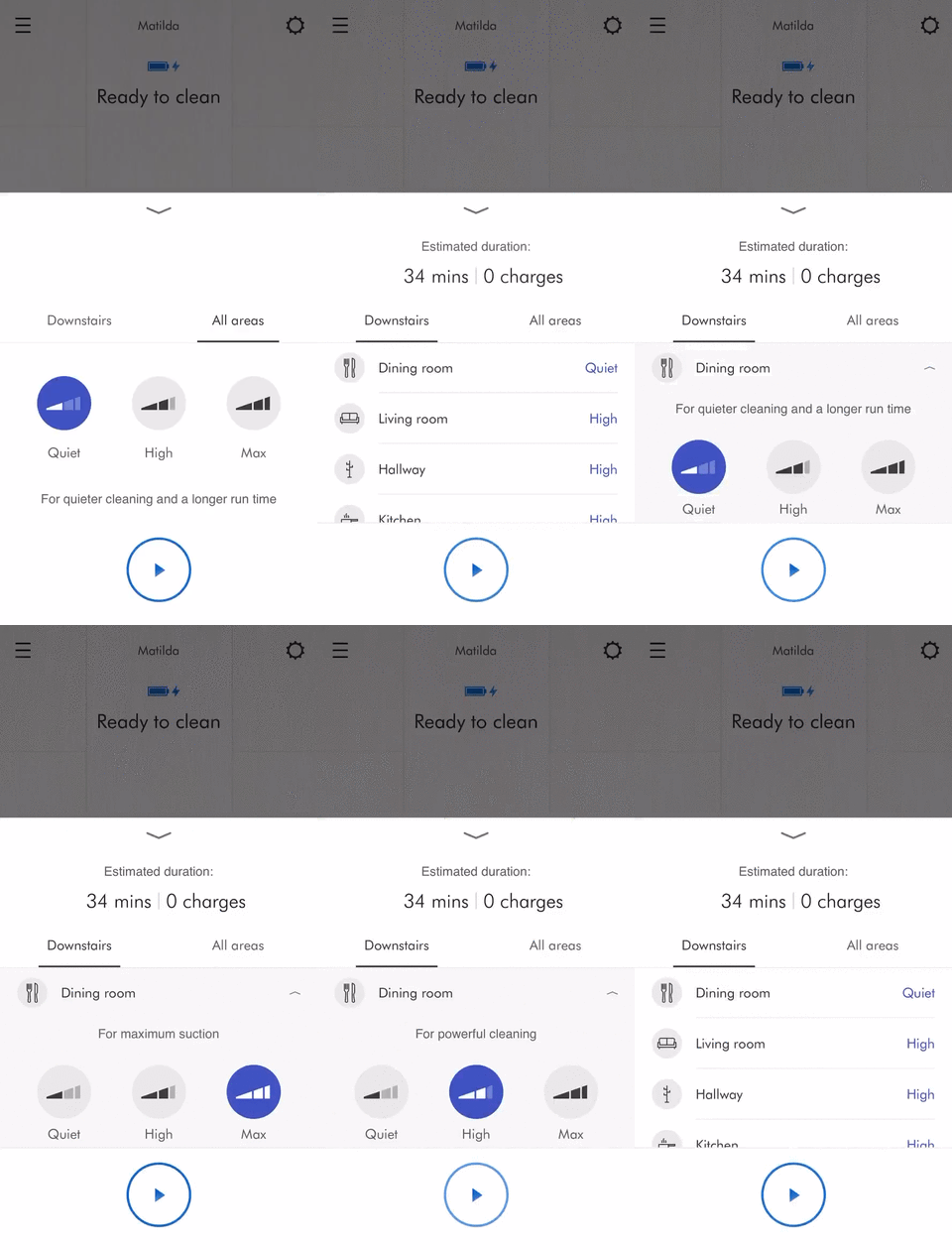
All the testing I had conducted proved this onboarding flow to be successful with little to no issues. Getting people to understand their map and create cleaning zones was a challenge we pulled off successfully. The software engineers developed the design and animations exactly to spec despite cutting out some functionality. In the end, we made it. Along the way, I had discovered fundamental interaction patterns critical in creating cleaning zones which jointed up nicely with the other features my colleagues designed for the 360 Heurist™ robot vacuum.
The outcomes
Successfully completed the feature critical to 360 Heurist™ robot vacuum release
Helped robot users understand their robot generated map
Enabled people to divide their map into zones to better manage power usage
Discovered interaction methods integral to creating cleaning zones
Allowed users to label their newly created rooms to easily identify them
Integrated power zoning into the existing robot controls
Selected Works
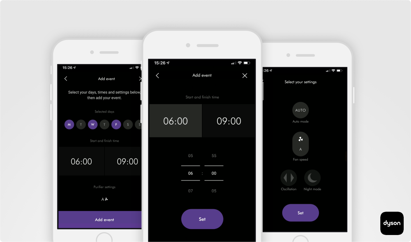
Dyson air purifier automation featureMobile app for iOT
OCLU Action CameraMobile app for iOT
Rounds video chat hangout networkMobile app for internet communication startup
