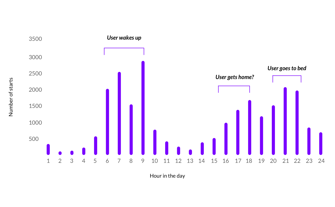
Air purifier automation feature
Dyson - 2017
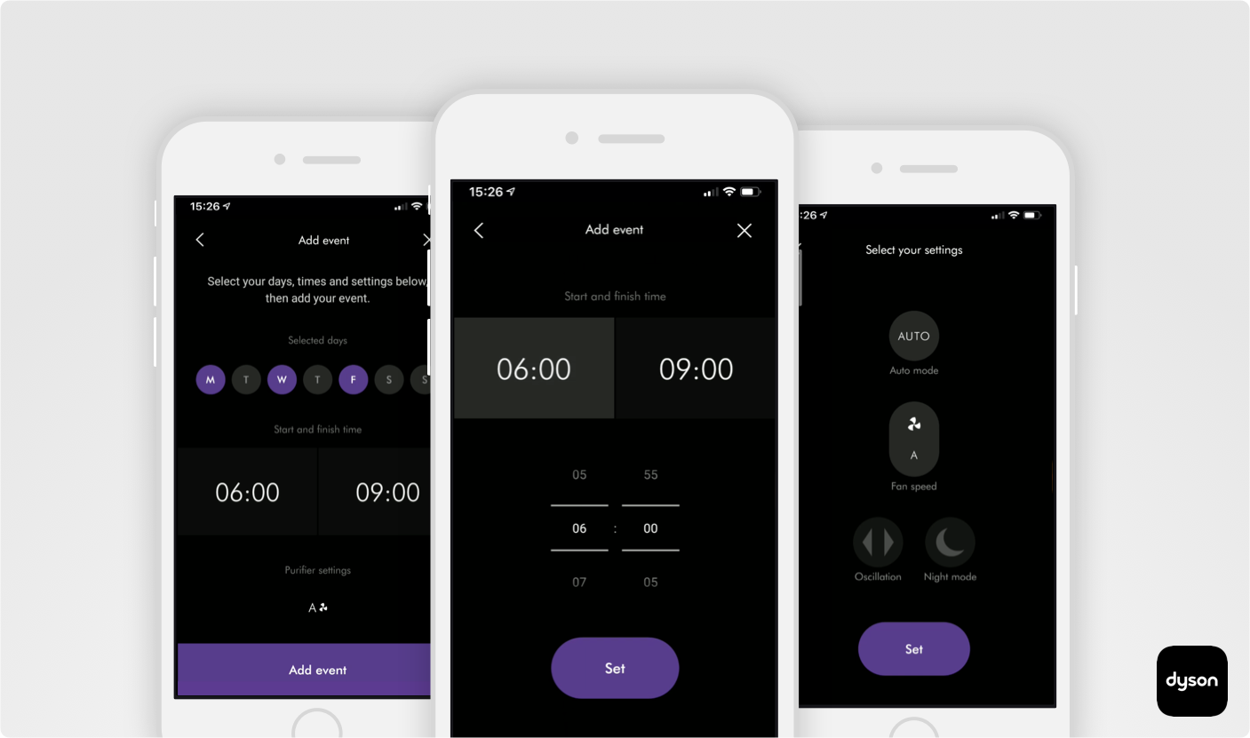
Dyson was rebooting their mobile app (Link) which monitors and controls all their connected appliances. It was to be written from scratch and branded with a new design system another team had been working on. Part of this rework was to redesign the scheduling functionality which enabled users to automate the operation of all their connected Dyson air purifiers.
My role
I worked with an industrial designer and a UI designer, a few software engineers as well as key stakeholders. My responsibility was to work with the industrial designer who conducted data research, prototype ideas, test and implement with a UI designer for the new branding. My contributions to the team and product involved
Storyboarding use case scenarios
Mapping personas
Wireframing user-flows
Brainstorming logic models with engineers
Prototyping low fidelity interfaces
Presenting to stakeholders
Conducting guerilla testing
Planning and observing usability trials
Directing a UI designer
Design objectives
Reduce the cognitive effort involved in setting up and editing schedules
Ensure the user interface & interaction patterns are consistent across machine types
Needed to look and feel like the rest of the newly designed app
The solution needed to work across all legacy & new machine use cases
Must be economical to build & maintain by the engineering team
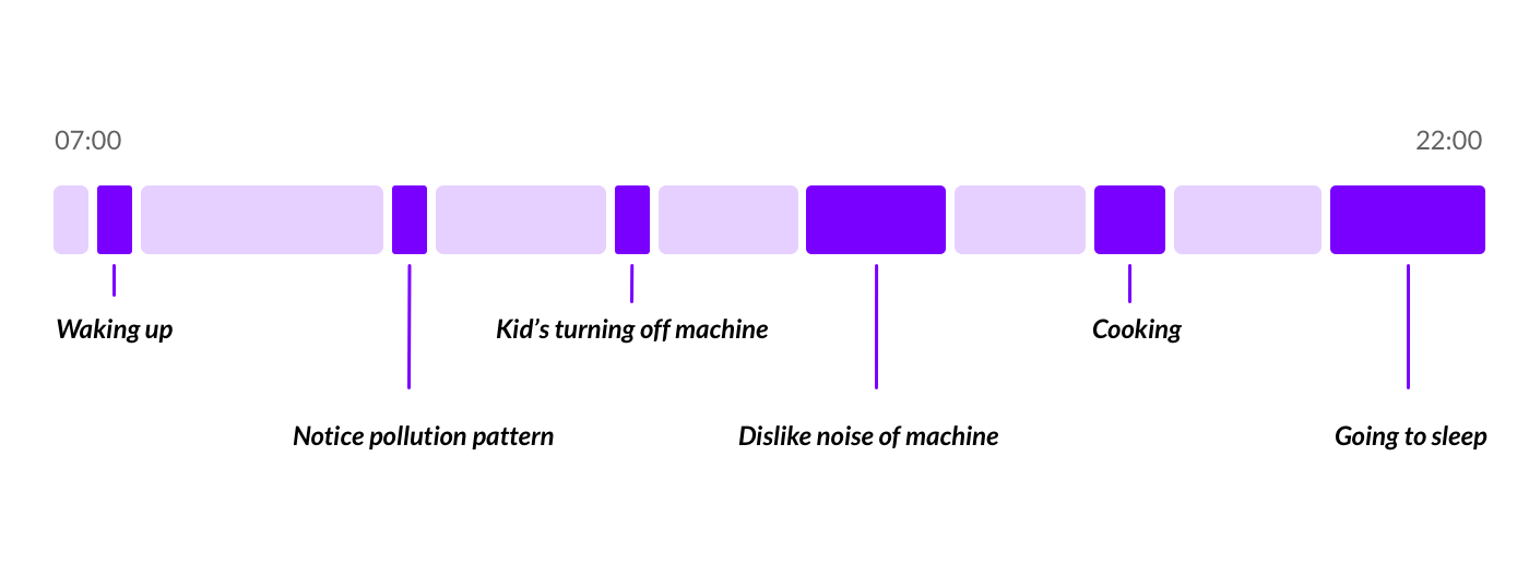
Listening to use case scenarios from users
"I have allergies in the summer so I use it mostly then"
"I noticed a pollution pattern at around traffic time"
"I want to turn the purifier off at night as it disturbs me"
"My kids play with the machine and keep turning it off"
"I have allergies in the summer so I use it mostly then"
"I noticed a pollution pattern at around traffic time"
"I want to turn the purifier off at night as it disturbs me"
"My kids play with the machine and keep turning it off"
"I like to use my hot & cool purifier for warmth in the winter"
"When I'm cooking to remove the smoke"
"My partner doesn't like the noise when they are at home"
"I like to use my hot & cool purifier for warmth in the winter"
"When I'm cooking to remove the smoke"
"My partner doesn't like the noise when they are at home"
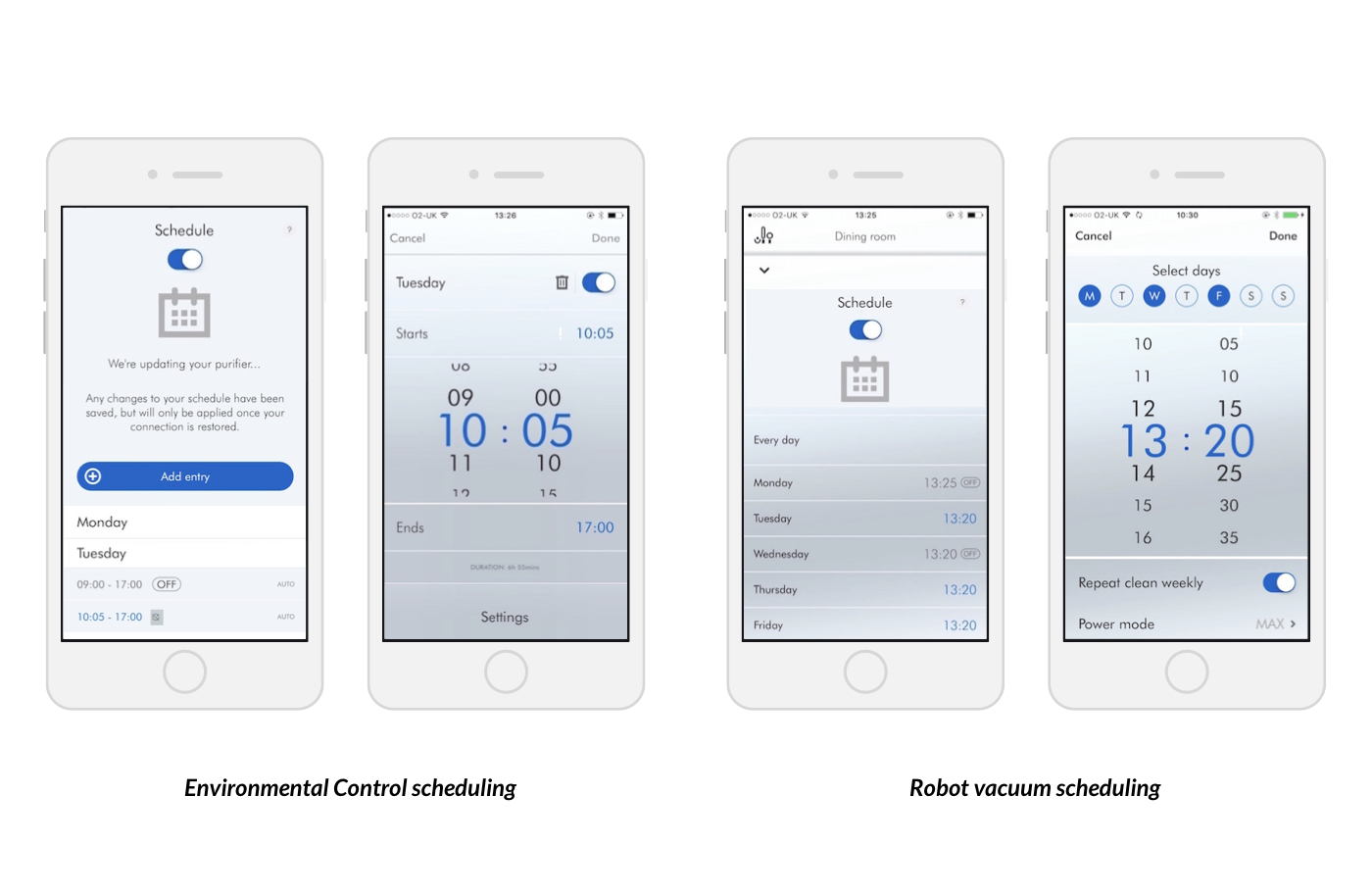
Competitor research
I looked at what other companies interface looked like in order to what common user patterns were out there.
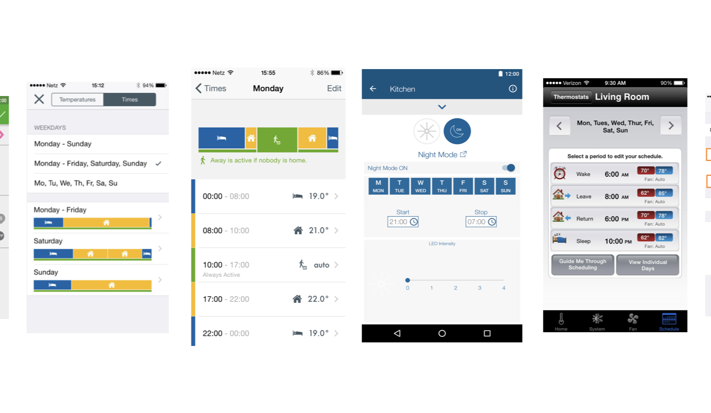
Defining new system logic
In order to create a new scheduler feature that works across all machine types, I came up with a new model that used events as a parent with the selected days as children. That would be easy to edit and satisfy all tasks users wanted to complete.
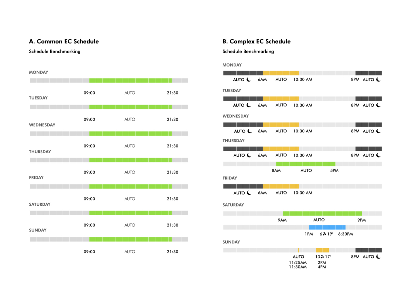
Benchmark I created that used all edge cases captured to design and test against
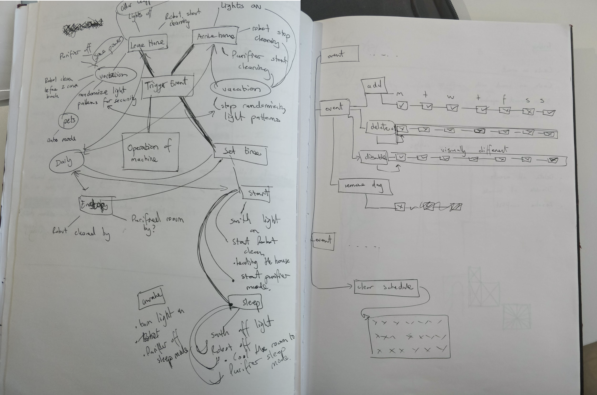

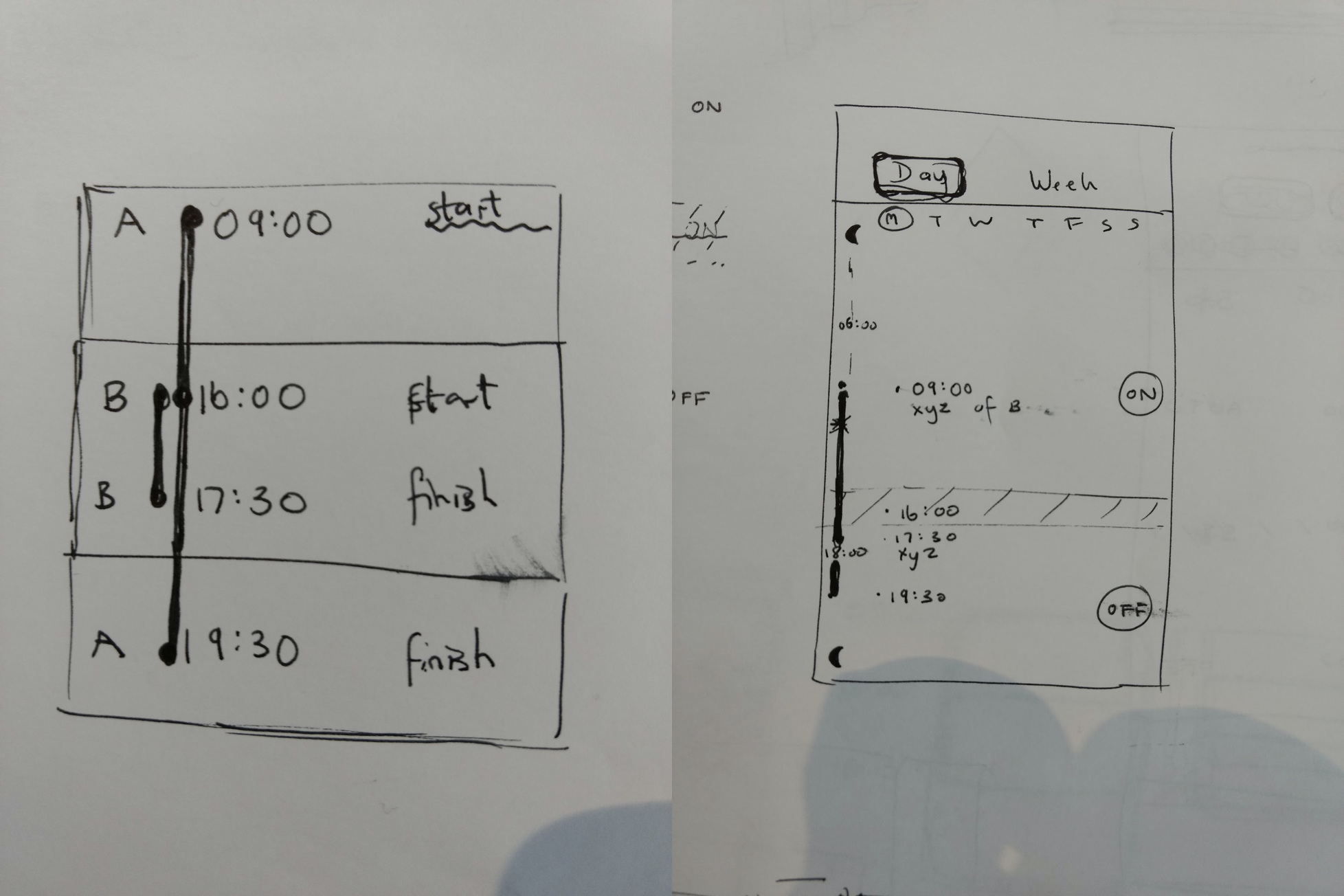

The new logic system I worked on with the technical product owner
Prototyping and testing user tasks & goals
I built dozens of prototypes, experimenting with various schedule entry methods, editing some of which that aren't included here for NDA purposes. Below are a few of the tasks users needed to complete. We tested these prototypes in a lab to validate:
Viewing events
Adding a new event
Editing an event
Deactivating an event
Deactivating the whole event
Deactivating the whole schedule
Indicate overlaps

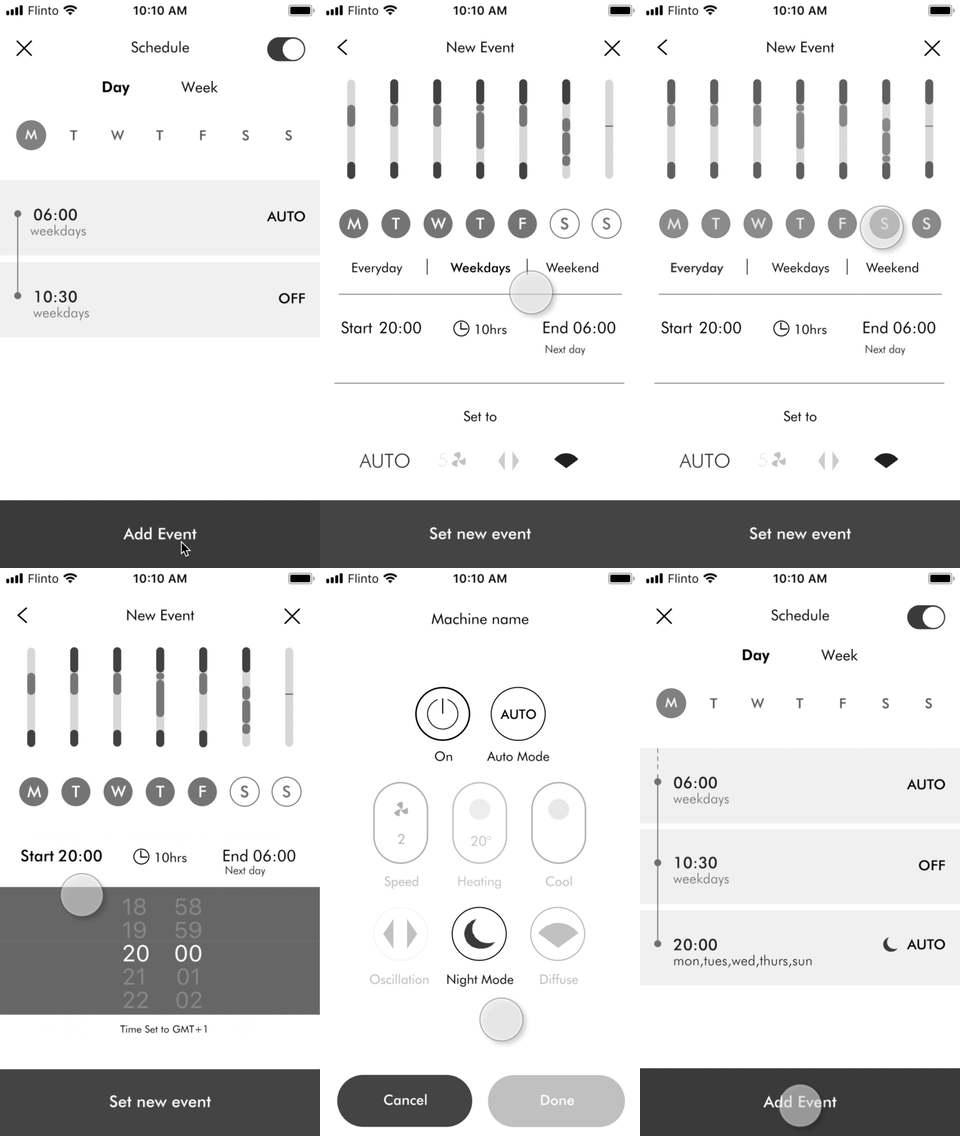
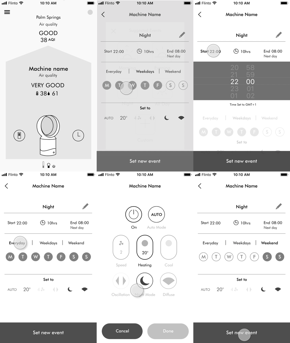
These are two of many prototypes showing a set of presets a user can select to speed setup. It also shows two different entry methods. The user can then set up the time and machine preferences.
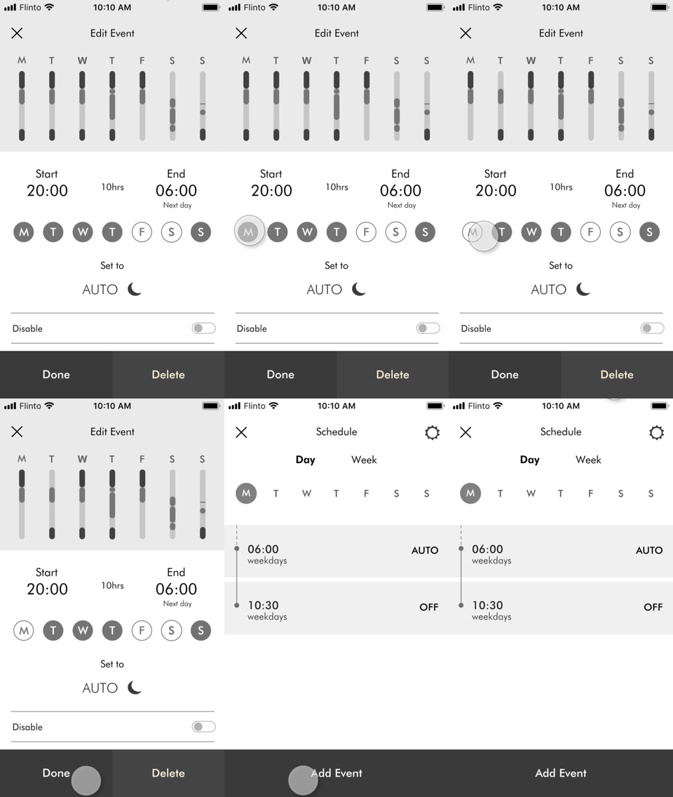
Removing a day from an event
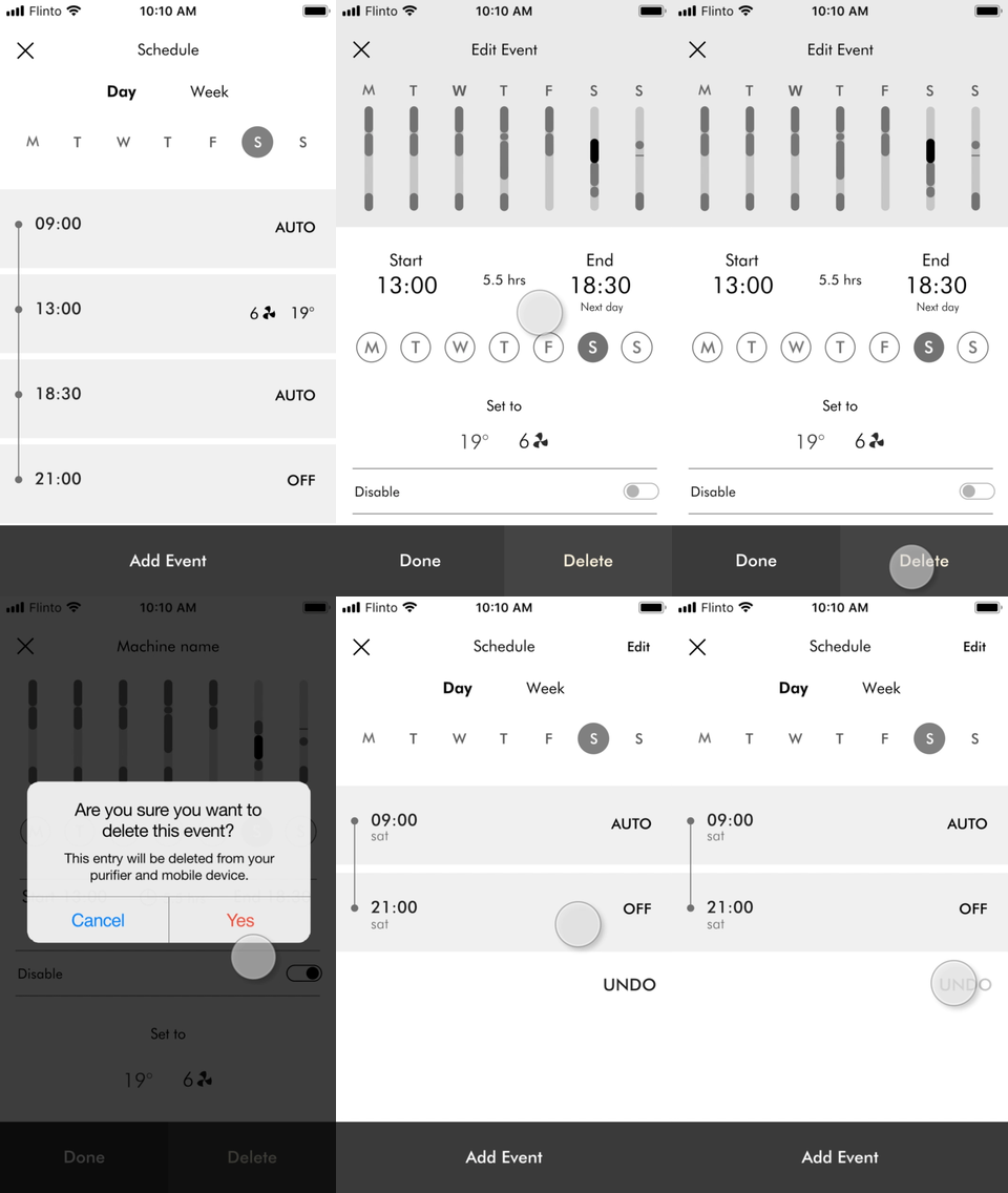
Deleting an event

Disabling an a whole event
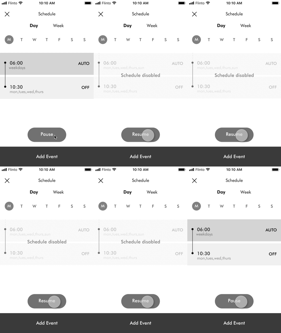
Disabling the whole schedule
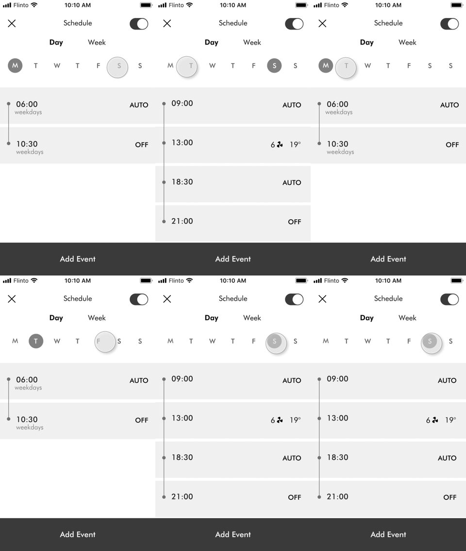
Scrubbing the week schedule
Iterated, stripped back and shipped in time
After some time restraints and engineering resources, we had to cut the weekly view in order to make the build and ship it. After receiving the usability test results, I iterated and simplified the design. I worked with a visual designer to apply the newly built design language to my wireframes.
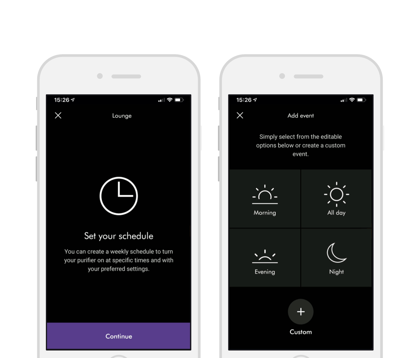
Selecting a preset
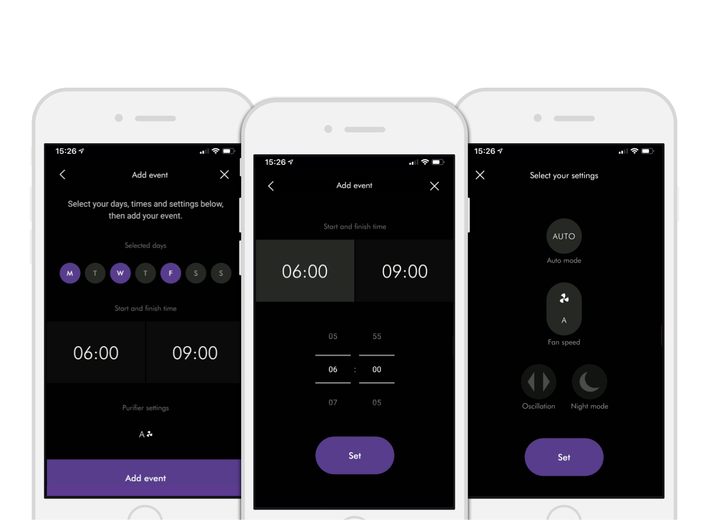
Adding an event

Viewing the schedule

Editing the event
Lessons learnt
A few things could have gone better. I could have spent less time researching and hypothesising and more time working with the engineers. Unfortunately, the company has not been structured this way creating a lot of waste work and major assumptions. In the end, we had achieved major goals that we set out, namely,
The outcome
Reduced cognitive load when setting up & adjusting a machine’s schedule.
More familiar UI & interaction across different machine types and mobile platforms
Worked across all legacy & new machine use cases
Economical to build & maintain
Reduced cognitive load when setting up & adjusting a machine’s schedule.
More familiar UI & interaction across different machine types and mobile platforms
Worked across all legacy & new machine use cases
Economical to build & maintain
Reduced cognitive load when setting up & adjusting a machine’s schedule.
More familiar UI & interaction across different machine types and mobile platforms
Worked across all legacy & new machine use cases
Economical to build & maintain
Reduced cognitive load when setting up & adjusting a machine’s schedule.
More familiar UI & interaction across different machine types and mobile platforms
Worked across all legacy & new machine use cases
Economical to build & maintain
Selected Works

Dyson robot vacuum cleaning zonesMobile app for iOT
OCLU Action CameraMobile app for iOT

Rounds video chat hangout networkMobile app for internet communication startup
